Kinetic comes up with a new quirky logo
By Satarupa Chakraborty - December 04, 2015
The new logo is designed on geometric patterns using three colours keeping three forces of nature (earth, water and air) in mind.
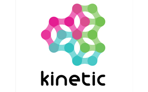 Leading media planning and buying agency Kinetic has come up with a new colourful quirky logo as opposed to their previous black-and-white logo. The new logo is designed on geometric patterns, symmetry and directional alignments formed with three forces of nature: earth, water and air. The three forces have been thought to create the'Kinetic energy' and convert into'Moving Gears'. With this new logo Kinetic wants to convey a message of not only its constant movement but also the idea of connecting with each other.
 A source from Kinetic explained, "Outdoor advertising as a sector is no longer stuck to creative boundaries, so why should the pioneers in the space be in a box? Hence we thought of coming up with this bold and fun logo. The three colours - green, turquoise and pink symbolise five pillars of Kinetic - Agile, Focused, Innovative, Passionate and Responsible.†With this new logo, the company has decided to get quirky and yet stay connected to numerous client ideologies and millions of consumers in the outdoor space.
Stay on top of OOH media trends
Advertisement