44% can’t identify KIA’s new logo: Survey results
By M4G Bureau - January 16, 2023
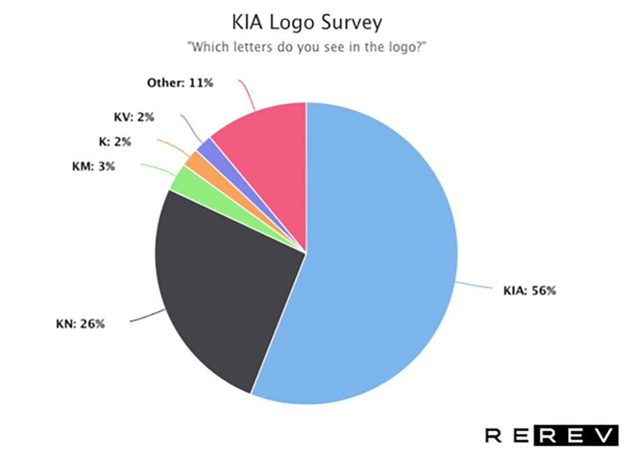
The most popular guess being ‘KN’ at 26%
A new survey by Rerev, presented in a blog prepared by Lilit Farmazina, a car enthusiast and writer, has found that only 56% were able to correctly identify the letters as “KIA,” with 44% incorrectly identifying them, and the most popular guess being “KN” at 26%. These findings suggest that the new KIA logo is not as easily recognisable as the company may have hoped.
 KIA is a car brand that has been around since 1944 and has become one of the world’s largest car manufacturers. Since 1994 the KIA logo consisted of the three capitalized letters in an oval red design.
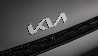
In January 2021, KIA revealed a redesign of their logo. The new logo was created with the intention of modernizing the brand and making it more distinct. The new logo design is a more minimalistic abstract approach. Despite being aesthetically pleasing, our survey has found that most people are unable to recognize the letters in the new KIA logo.
We showed the above image with the new KIA logo to 1,062 survey participants and asked them “which letters do you see in the logo?”. Despite the logo featuring prominently in KIA’s marketing materials and the badge on their cars, 44% of participants were unable to correctly identify the letters. Just 56% managed to correctly identify what letters the logo stood for.
The most frequent guess was “KN” with 26% of responses. Google search data attests to this confusion. There are around 30,000 monthly searches for “KN car”. This is followed by 3% answering “KM” which likewise sees 1,200 monthly Google searches for “KM car”. While 2% answered simply “K”, apparently unable to make out the rest. Another 2% answered “VK” while the rest submitted similar variations like “KVI”, “KVA”, “KLA”, “VKN”, and “VAA”.
The survey highlights the importance of conducting thorough market research when designing a logo. Companies should ensure that their logos are easily recognizable to their target audience to effectively convey their brand message.
We speculate that the difficulty in recognizing the letters in the KIA logo is due to the use of a unique font with non-traditional letterforms. The letters in the logo are too stylized and do not closely resemble the traditional forms of the letters they represent. As a result, the letters are very open to interpretation.
While KIA has likely done an extensive amount of research on how people perceive their logo to shape their brand identity, our research shows the brand has fallen short. These findings are surprising given the amount of time and resources that companies typically put into designing their logos. A logo is often a key part of a company’s brand identity and is meant to be easily recognizable to consumers.
Overall, it appears KIA’s new logo has had difficulty in modernizing its brand logo while keeping it recognizable. There is still room for improvement when it comes to how people perceive the company’s lettering. With continued research and testing, KIA can ensure that its branding resonates with customers worldwide.
Stay on top of OOH media trends