Brand Insights
Kinetic comes up with a new quirky logo
The new logo is designed on geometric patterns using three colours keeping three forces of nature (earth, water and air) in mind.
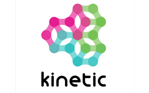 Leading media planning and buying agency Kinetic has come up with a new colourful quirky logo as opposed to their previous black-and-white logo. The new logo is designed on geometric patterns, symmetry and directional alignments formed with three forces of nature: earth, water and air. The three forces have been thought to create the’Kinetic energy’ and convert into’Moving Gears’. With this new logo Kinetic wants to convey a message of not only its constant movement but also the idea of connecting with each other.
A source from Kinetic explained, “Outdoor advertising as a sector is no longer stuck to creative boundaries, so why should the pioneers in the space be in a box? Hence we thought of coming up with this bold and fun logo. The three colours – green, turquoise and pink symbolise five pillars of Kinetic – Agile, Focused, Innovative, Passionate and Responsible. With this new logo, the company has decided to get quirky and yet stay connected to numerous client ideologies and millions of consumers in the outdoor space.


Daily Newsletter
Subscribe to receive the latest OOH
industry updates
“Partnerships are the key to unlocking pDOOH value” – Remi Roques, Broadsign
Make Outdoor creative again: Tim Bleakley rallies the ad industry
With 20+ branded trains and 200+ screens, Gujarat Media Company charts a new course in OOH
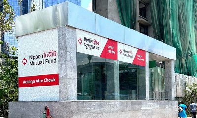
Nippon India Mutual Fund acquires station branding rights for Acharya Atre Station on Mumbai Metro Line 3.
Mark Boidman of Solomon Partners and Barry Frey of the DPAA global trade body to speak at WOO congress in Mexico
Puma becomes PVMA for PV Sindhu
Acclaimed Actor Manoj Joshi to deliver an inspirational address at OAC 2024
Zepto’s Fast 10 Minute Delivery Saves the Day for Game Night in Ahmedabad!
Blinkit in association with Kinetic India goes all Bollywood
Signpost India Limited launches Dharampeth One in Nagpur
‘Let’s create an empathetic space for women’
‘It won’t just be a man’s world anymore’
‘We’re actively exploring acquisitions and working to increase our inventory’
A habit of success at Prakash Arts
‘OOH is an important channel to connect with corporate audiences’

Sales Manager – AdZ (Digital Advertising)
Estontec Group’s fast-growing adtech brand AdZ is hiring a Sales Manager to drive digital media sales and client growth. This...
Onboarding Specialist
Join Estontec Group’s transit media brand BrandonWheelz as an Onboarding Specialist, managing campaign execution, vendor coordination, and media planning across...

Operation Manager
Company Description: BajuGali an Advertisement Company is a leading firm specializing in advertising and marketing services. We provide innovative solutions...

Senior Copy Editor
No of openings: 1 Experience/ qualifications: 3-4 years in any media/news publication Graduate Degree in any discipline, degree in Journalism...

Sales Specialist at BajuGali (OOH Advertising Company)
At BajuGali, we are a marketing and advertising agency that specializes in transforming creative visions into reality for brands and...
Multiple Openings – Bright Outdoor Media (Business Development Manager, Admin & HR Manager, Sales Executive)
BRIGHT OUTDOOR MEDIA LIMITED SINCE 1980 JOB VACANCY: Business Development Manager (Media Selling Exp. is a must) Admin & HR...

Sales Executive – Street Furniture/Transport
Job description – Sales (Street Furniture/Transport) Location – Delhi, Mumbai, Chennai Designation & Compensation – Will depend on the candidate...
Sales Executive cum Coordinator, OOH Media
Key Responsibilities 1. Sales Execution Lead Generation and Prospecting Client Meetings and Presentations Sales Negotiation and Closing Reporting and Forecasting...
Platinum Outdoor creates a blooming spectacle for Mia by Tanishq’s Flora Collection
From a pink-themed parking zone with hand-painted murals to branded boom barriers and frisking booths, every touchpoint was crafted to...
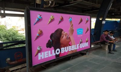
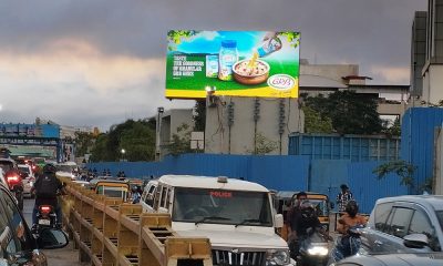
Mother Dairy brings summer chill to the streets with OOH campaign
The campaign is executed by ideacafe.agency
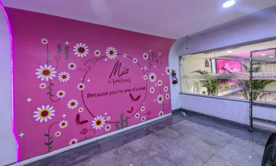
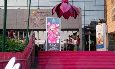
Nexus Malls introduces India’s first parking lot naming rights with Mia by Tanishq
This experience is executed in collaboration with Platinum Outdoor
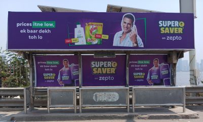
Zepto’s OOH campaign to amplify SuperSaver proposition across 62 towns
The campaign is executed by Ideacafe.agency
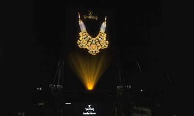
Tanishq unveils ‘Kundan Stories’ with India’s tallest holo-projection
This campaign is done in collaboration with Laqshya Media Group
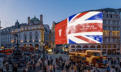
DCMS and The Together Coalition join forces to mark victory on Europe Day
The campaign is done in partnership with M+C Saatchi Group UK and Ocean Outdoor
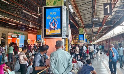
AD&VI DOOH network inaugurated at Anand Vihar Railway Terminal
The project was inaugurated by M. Paramasivam, Executive Director of Punjab National Bank (PNB) in the presence of senior Railway...
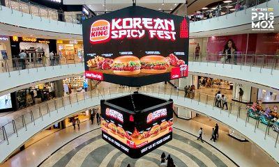
Burger King’s DOOH innovation for Korean Spicy Fest
The campaign is executed by Khushi Advertising
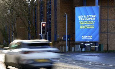
VCCP and Kwik Fit make motorists happier, safer drivers with tailored jokes on roadside ads
‘Road Happy’ is an Ocean Outdoor digital creative competition winner
Srishti Communications launches DOOH media network at TIDEL Park Chennai
Legacy IT campus becomes home to premium outdoor and indoor digital advertising formats
-

 OOH Industry
Data-driven media buying: Lessons from Jun Sakurai on Japan’s OOH evolution
-
 OOH Industry
Nippon India Mutual Fund acquires station branding rights for Acharya Atre Station on Mumbai Metro Line 3.
-

 DOOH
DOOHMake Outdoor creative again: Tim Bleakley rallies the ad industry
-

 Planning & Buying
It’s Spotlight takes over digital screens at CP.67 mall, Mohali