Brand Insights
Kinetic comes up with a new quirky logo
The new logo is designed on geometric patterns using three colours keeping three forces of nature (earth, water and air) in mind.
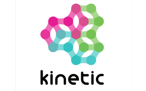 Leading media planning and buying agency Kinetic has come up with a new colourful quirky logo as opposed to their previous black-and-white logo. The new logo is designed on geometric patterns, symmetry and directional alignments formed with three forces of nature: earth, water and air. The three forces have been thought to create the’Kinetic energy’ and convert into’Moving Gears’. With this new logo Kinetic wants to convey a message of not only its constant movement but also the idea of connecting with each other.
A source from Kinetic explained, “Outdoor advertising as a sector is no longer stuck to creative boundaries, so why should the pioneers in the space be in a box? Hence we thought of coming up with this bold and fun logo. The three colours – green, turquoise and pink symbolise five pillars of Kinetic – Agile, Focused, Innovative, Passionate and Responsible. With this new logo, the company has decided to get quirky and yet stay connected to numerous client ideologies and millions of consumers in the outdoor space.

Daily Newsletter
Subscribe to receive the latest OOH
industry updates
Ajit Varghese, Partner & Group CEO of Madison World, to address OAC 2026
Azazul Haque joins OOH Advertising Awards 2026 as Co-Jury Chair
From field barcode to sunburnt car & free beer: Cannes Outdoor Lions 2026 say it all!
Fortune Poha celebrates World Poha Day with OOH installation in Indore
Amnesty International Canada and Cossette ask Quebec to ‘Change Your Perspective’
Puma becomes PVMA for PV Sindhu
HOCCO’s Aamchi campaign brings mango tree to Ahmedabad
Blinkit in association with Kinetic India goes all Bollywood
Acclaimed Actor Manoj Joshi to deliver an inspirational address at OAC 2024
Zepto’s Fast 10 Minute Delivery Saves the Day for Game Night in Ahmedabad!
‘Let’s create an empathetic space for women’
‘It won’t just be a man’s world anymore’
‘We’re actively exploring acquisitions and working to increase our inventory’
A habit of success at Prakash Arts
‘OOH is an important channel to connect with corporate audiences’
Digital Marketing/Social Media Executive
Job Description: Planning and driving strategy for the company’s online/promotional content based on new SEO/digital performance metrics Planning and...
Content Writer- Reporter
Job Description Reporting and writing daily industry news for company publications related to out of home advertising and brand marketing...
Sales Manager (Amritsar, J&K, Chandigarh, Mumbai, Vadodara, Udaipur, U.P.)
Orango has been involved in creating, building, reviving and growing brands. Orango builds powerful connections with their customers & people...
Sales Executive
Established B2B Media and Events Group VJ Media Works is looking for sales executives
Digital Marketing/Social Media Executives
Established B2B Media and Events Group VJ Media Works is looking for the following: Digital Marketing/Social Media Executives Location: Mumbai/Bangalore...

Sales Manager – AdZ (Digital Advertising)
Estontec Group’s fast-growing adtech brand AdZ is hiring a Sales Manager to drive digital media sales and client growth. This...
Onboarding Specialist
Join Estontec Group’s transit media brand BrandonWheelz as an Onboarding Specialist, managing campaign execution, vendor coordination, and media planning across...
Operation Manager
Company Description: BajuGali an Advertisement Company is a leading firm specializing in advertising and marketing services. We provide innovative solutions...
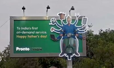
Pronto celebrates Father’s Day with illuminated OOH tribute in Delhi
The campaign brought alive the many roles fathers play through a striking multi-arm 3D billboard installation.
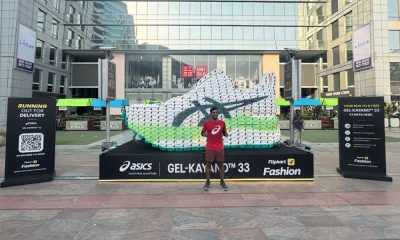
Flipkart Fashion and ASICS turn Cyber Hub into a giant sneaker showcase
The larger-than-life installation, crafted entirely from corrugated boxes, transformed Gurugram’s Cyber Hub into an immersive brand experience celebrating the launch...
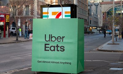
Uber Eats bags rival brands’ ads in playful OOH campaign
The campaign is live across Sydney and Brisbane
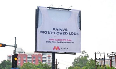
Myntra celebrates Father’s Day with tribute to Dad’s favourite outfit
The fashion platform transformed a billboard into a giant sleeveless vest, calling it Banyanboard, turning a familiar dad-style staple into...
Netflix turns Mumbai Metro into a real-life ‘Lock Upp’ experience
The campaign executed by Carpe Diem Agency across Mumbai Metro Line 1, with Times OOH holding the rights for the...
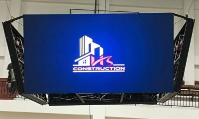
Infonics Technologies installs four-sided LED display at Mizoram indoor sports stadium
The suspended four-sided LED display has been designed to deliver 360-degree visibility, enhancing the spectator experience while creating a new...
Department for Education UK launches ‘Do Something Big’ early years recruitment drive in Manchester
The campaign is created by Havas London and live across Ocean Outdoor's Loop Network with production handled by Prose on...

Big Happy launches dynamic creative optimization for 3D DOOH
New solution combines contextual relevance with bespoke CGI-powered creative to deliver campaigns that adapt in real time to what audiences...

How this ad tech platform bridges the gap between campaign planning & execution
Having spent years managing OOH campaigns, Deepak Bansal built gOGig to bring real-time visibility, accountability and field intelligence to campaign...
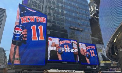
Pepsi celebrates Knicks fever with real-time fan-powered OOH campaign
The campaign is live across New York
-
 Campaigns
Uber Eats bags rival brands’ ads in playful OOH campaign
-
 Campaigns
Myntra celebrates Father’s Day with tribute to Dad’s favourite outfit
-
 Digital Display
Infonics Technologies installs four-sided LED display at Mizoram indoor sports stadium
-
 OAC
OACRaheel Amjad of JCDecaux to address a critical question regarding OOH’s future at OAC 2026
