Campaigns
KitKat turns the humble dash into a break
The campaign is conceptualised by Courage in Canada
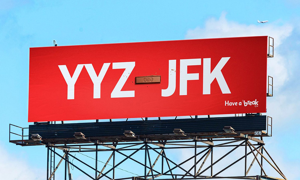
There is something quietly clever about KitKat’s latest OOH campaign. Rather than telling people to take a break, it shows them one, hidden in plain sight in the spaces they already move through every day.
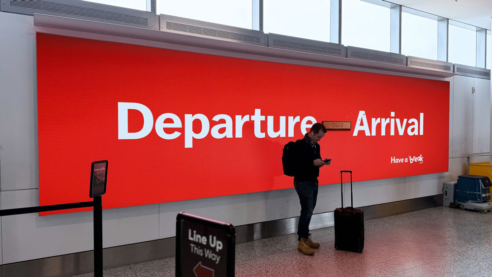
The campaign, developed by Courage, is built on a single visual idea: replace the dash symbol with a KitKat bar. It sounds simple, and that is precisely the point. The dash already means a pause, between a departure and an arrival, between a start time and an end time, between one version of a file and the next. KitKat just slides into that space and makes itself at home.
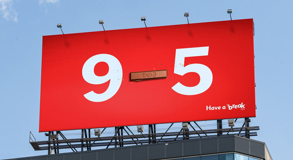
The executions are where the idea earns its keep. A 9 to 5 workday. A flight from YYZ to JFK. The all too familiar office ritual of final.ppt becoming finalv2.ppt. In each case, the KitKat bar sits between the two ends of a familiar transition, doing the work of the dash without saying a word about breaks or chocolate. The brand does not need to explain itself. The connection is already there.
Daily Newsletter
Subscribe to receive the latest OOH
industry updates
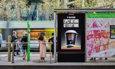
Pepsi celebrates Knicks fever with real-time fan-powered OOH campaign
Sony LIV brings Gullak 5 to life with piggy bank activation
Khushi Advertising partners 20th edition of OAC
Neil Eddleston, Founder & Director of Runor Data Consulting, to spotlight data that really matters at OAC 2026
Xtreme Media once again is the sponsor of The Quintessential OOH Quiz at OAC 2026
Puma becomes PVMA for PV Sindhu
HOCCO’s Aamchi campaign brings mango tree to Ahmedabad
Blinkit in association with Kinetic India goes all Bollywood
Acclaimed Actor Manoj Joshi to deliver an inspirational address at OAC 2024
Zepto’s Fast 10 Minute Delivery Saves the Day for Game Night in Ahmedabad!
‘Let’s create an empathetic space for women’
‘It won’t just be a man’s world anymore’
‘We’re actively exploring acquisitions and working to increase our inventory’
A habit of success at Prakash Arts
‘OOH is an important channel to connect with corporate audiences’
Digital Marketing/Social Media Executive
Job Description: Planning and driving strategy for the company’s online/promotional content based on new SEO/digital performance metrics Planning and...
Content Writer- Reporter
Job Description Reporting and writing daily industry news for company publications related to out of home advertising and brand marketing...
Sales Manager (Amritsar, J&K, Chandigarh, Mumbai, Vadodara, Udaipur, U.P.)
Orango has been involved in creating, building, reviving and growing brands. Orango builds powerful connections with their customers & people...
Sales Executive
Established B2B Media and Events Group VJ Media Works is looking for sales executives
Digital Marketing/Social Media Executives
Established B2B Media and Events Group VJ Media Works is looking for the following: Digital Marketing/Social Media Executives Location: Mumbai/Bangalore...

Sales Manager – AdZ (Digital Advertising)
Estontec Group’s fast-growing adtech brand AdZ is hiring a Sales Manager to drive digital media sales and client growth. This...
Onboarding Specialist
Join Estontec Group’s transit media brand BrandonWheelz as an Onboarding Specialist, managing campaign execution, vendor coordination, and media planning across...
Operation Manager
Company Description: BajuGali an Advertisement Company is a leading firm specializing in advertising and marketing services. We provide innovative solutions...
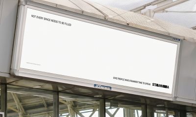
STAMMA uses empty billboards to deliver a powerful message about listening
The campaign is created by Iris London and supported by pro bono media from JCDecaux
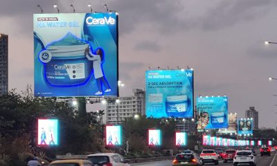
CeraVe makes a high-impact splash with illuminated OOH launch for HA Water Gel
The campaign is executed by Dentsu and Sakshi Advertising Company in Mumbai
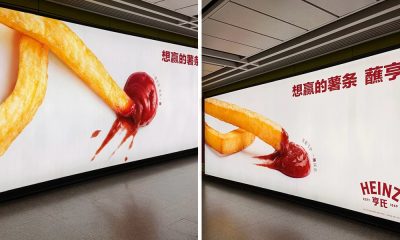
Heinz kicks off World Cup fever with a football-inspired OOH campaign
The campaign is executed across China
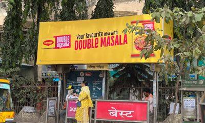
Maggi doubles down on flavour with high-impact OOH campaign
The campaign is executed across Mumbai
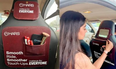
MARS Cosmetics turns Delhi NCR cabs into moving vanity rooms
The campaign is executed by Cash ur Drive Ltd
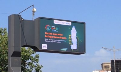
Maha r-PET Abhiyaan takes recycling message to millions through OOH campaign
The Maharashtra Government and Hindustan Coca-Cola Beverages joined forces to encourage responsible PET bottle recycling through a large-scale public awareness...
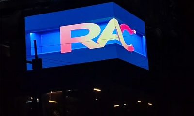
Royal Advertising unveils 90-degree LED screen in Lucknow
The new site is expected to cater to a wide range of advertisers, offering opportunities for high-visibility brand campaigns, product...
Broadsign, Global Netherlands, and Draft Digital launch first agentic AI OOH campaign
Agentic AI powered the buy from beginning to end, using the brand’s campaign goals to inform audience and venue targeting,...

Vistar Media study finds motion and 3D significantly improve DOOH campaign performance
The research has been conducted in partnership with Omnicom Media and JCDecaux
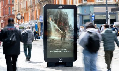
The Times uses mixed reality AI to turn UK billboards into “windows to the past”
The campaign is created by The Times and T&P and executed on Ocean Outdoor’s assets
-
 Campaigns
Maggi doubles down on flavour with high-impact OOH campaign
-
 Campaigns
Heinz kicks off World Cup fever with a football-inspired OOH campaign
-
 OAC
OACXtreme Media once again is the sponsor of The Quintessential OOH Quiz at OAC 2026
-
 Industry News
IOAA Media Owners Awards 2026 set to recognize & celebrate OOH industry players