Campaigns
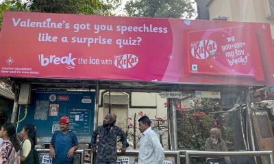
KitKat turns its logo into a quiet reminder to ‘have a break’
The campaign is conceptualized by VML
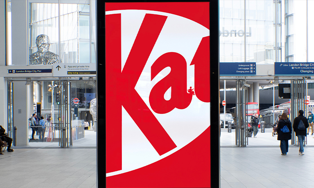
KitKat’s latest out-of-home campaign strips the brand back to its bare essentials, reinterpreting its iconic identity through a series of minimalist posters across the UK.
Conceptualised by VML, the campaign titled ‘Little Breaks’ transforms the familiar KitKat logo into a canvas for subtle, hand-drawn illustrations.
Each execution features a cropped version of the brand’s logo, within which tiny illustrated characters are embedded. These figures are shown engaging in everyday moments of pause, reading, playing music, tossing a ball, or simply unwinding, quietly reinforcing the idea of taking a break.
The campaign removes all copy, including the brand’s long-standing tagline “Have a break, have a KitKat,” relying entirely on visual storytelling and brand recognition.
The illustrations are deliberately minimal and discreet, requiring viewers to look closer and spend a moment with the creative to discover the hidden scenes. This interaction becomes part of the idea itself, mirroring the act of pausing in a busy environment.
Created by art director Jasper McIver and copywriter Zebedee Devey Waterhouse, the posters continue KitKat’s long-standing association with breaks, while pushing the brand further into a more stripped-back, design-led approach. The campaign is currently live across high-traffic locations in the UK, including transit hubs such as London Bridge and King’s Cross St Pancras, placing the work within fast-paced, high-attention environments.
Daily Newsletter
Subscribe to receive the latest OOH
industry updates
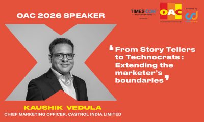
Kaushik Vedula of Castrol India to spotlight marketer’s expanding KRAs at OAC 2026
Aaztec India to showcase indigenous LED innovations at OAC Expo 2026
“We have not got the fundamentals right!”
Meet Boston seals transatlantic friendship with Scottish Out of Home campaign
Sensodyne serves up immersive Wimbledon-themed OOH experience at London’s Borough Yards
Puma becomes PVMA for PV Sindhu
HOCCO’s Aamchi campaign brings mango tree to Ahmedabad
Blinkit in association with Kinetic India goes all Bollywood
Acclaimed Actor Manoj Joshi to deliver an inspirational address at OAC 2024
Zepto’s Fast 10 Minute Delivery Saves the Day for Game Night in Ahmedabad!
‘Let’s create an empathetic space for women’
‘It won’t just be a man’s world anymore’
‘We’re actively exploring acquisitions and working to increase our inventory’
A habit of success at Prakash Arts
‘OOH is an important channel to connect with corporate audiences’

Sales Manager (Amritsar, J&K, Chandigarh, Mumbai, Vadodara, Udaipur, U.P.)
Orango has been involved in creating, building, reviving and growing brands. Orango builds powerful connections with their customers & people...
Sales Executive
Established B2B Media and Events Group VJ Media Works is looking for sales executives
Digital Marketing/Social Media Executives
Established B2B Media and Events Group VJ Media Works is looking for the following: Digital Marketing/Social Media Executives Location: Mumbai/Bangalore...

Sales Manager – AdZ (Digital Advertising)
Estontec Group’s fast-growing adtech brand AdZ is hiring a Sales Manager to drive digital media sales and client growth. This...
Onboarding Specialist
Join Estontec Group’s transit media brand BrandonWheelz as an Onboarding Specialist, managing campaign execution, vendor coordination, and media planning across...
Operation Manager
Company Description: BajuGali an Advertisement Company is a leading firm specializing in advertising and marketing services. We provide innovative solutions...

Senior Copy Editor
No of openings: 1 Experience/ qualifications: 3-4 years in any media/news publication Graduate Degree in any discipline, degree in Journalism...

Sales Specialist at BajuGali (OOH Advertising Company)
At BajuGali, we are a marketing and advertising agency that specializes in transforming creative visions into reality for brands and...
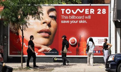
The billboard that stops, sprays & spritzes you!
Tower 28 installed the world's first hypochlorous acid-spraying billboard in downtown NYC- the SOS Spritz Stop - to promote its...
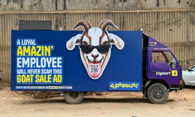
Flipkart parks cheeky OOH stunt outside Amazon office to drive GOAT Sale buzz
A truck-mounted billboard with a provocative message and QR code turned Amazon employees into unexpected participants in Flipkart's latest campaign.
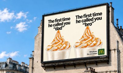
McDonald’s France serves up every emotion with witty OOH campaign for McFlurry
Created by TBWA\Paris, the campaign celebrates life's big wins, awkward moments and everyday memories, positioning McFlurry as the perfect companion...
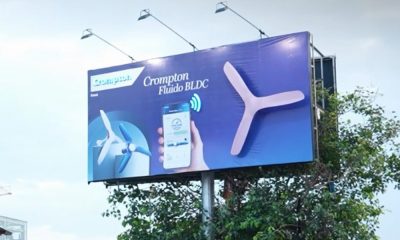
Crompton’s tech‑powered, interactive OOH at Chennai Central
To campaign is conceptualised by Tribes Communication
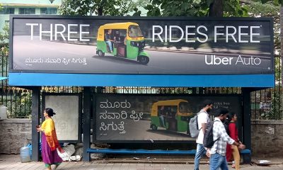
Uber Auto turns everyday bus shelters into last-mile decision points across Bengaluru and Pune
The campaign is executed by Say It Loud Media

FatTail and Vistar Media partner to integrate DOOH Booking in AdBook
This partnership allows media owners to plan, book, and manage digital out- of-home (DOOH) inventory directly within their existing AdBook...
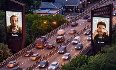
BackLite UK expands landmark series portfolio with Chiswick Towers addition
LeShuttle and Oura will be the first to advertise at the premium site, reaching nine million road users a month
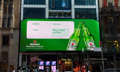
Heineken translates soccer for America through contextual DOOH campaign
The campaign is created by LePub New York
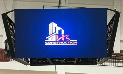
Infonics Technologies installs four-sided LED display at Mizoram indoor sports stadium
The suspended four-sided LED display has been designed to deliver 360-degree visibility, enhancing the spectator experience while creating a new...
Department for Education UK launches ‘Do Something Big’ early years recruitment drive in Manchester
The campaign is created by Havas London and live across Ocean Outdoor's Loop Network with production handled by Prose on...
-
 Campaigns
McDonald’s France serves up every emotion with witty OOH campaign for McFlurry
-
 OAC
OACKaushik Vedula of Castrol India to spotlight marketer’s expanding KRAs at OAC 2026
-
 Campaigns
The billboard that stops, sprays & spritzes you!
-

 People
Hocco elevates Roli Shrivastava as Chief Marketing Officer