Campaigns
McDonald’s New Zealand lets menu names do the heavy lifting
Created by McCann NZ bold red billboards featuring iconic menu names turn simplicity into a powerful brand reminder across New Zealand.

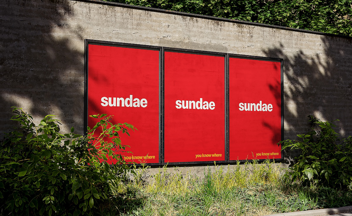
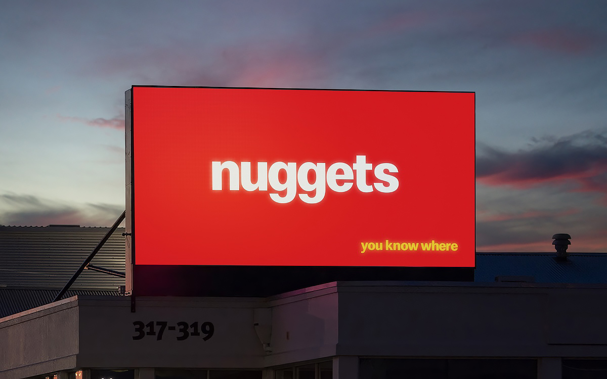
McDonald’s New Zealand has rolled out a striking out-of-home campaign that strips advertising down to its most recognisable elements — the brand’s iconic menu items. Created by McCann New Zealand, the campaign uses minimalist visuals where classic McDonald’s items such as cheeseburger, fries, nuggets, hotcakes, apple pie and sundae appear in large white typography against the brand’s unmistakable red background.
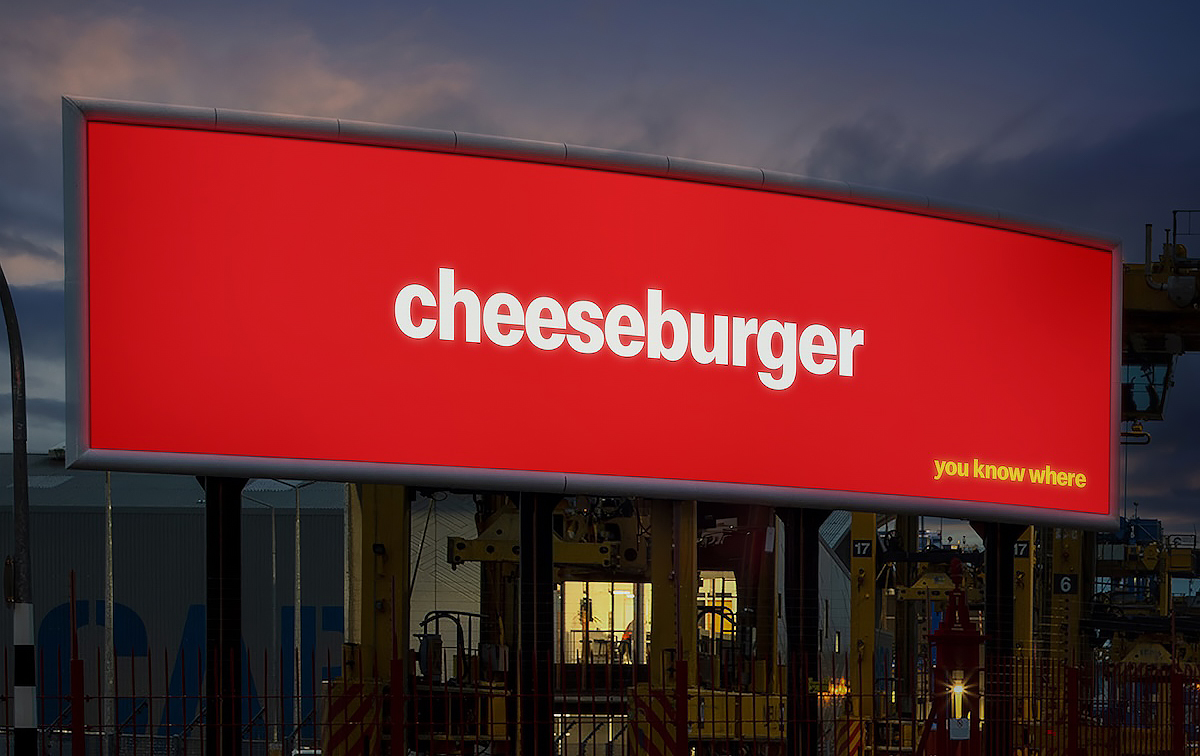
The executions appear across large billboards, street-side panels and high-visibility urban locations. Each creative features just the menu item name placed boldly at the centre, while a small line reading “you know where” sits in the corner — a confident nod to the brand’s universal recognition. The simplicity of the design ensures that even at a glance, audiences immediately connect the words with the McDonald’s experience.
Across the placements, the format remains consistent but adapts to different environments. A large roadside billboard displays “nuggets” glowing against the evening sky, while another massive structure simply reads “hotcakes.” In airport media spaces and city walls, panels feature “apple pie,” “fries,” or “cheeseburger,” relying entirely on brand familiarity rather than product imagery.
By removing visuals of the food itself, the campaign highlights how deeply embedded these items are in popular culture. The instantly recognisable menu names, paired with the signature colour palette, make the brand unmistakable without needing to say its name outright — demonstrating the enduring power of simplicity in outdoor advertising.